“Join Our Team” Page
“CHIA Mentoring” Logo
Click to expand.
The Center for Health Information and Analysis
Concepts:
“Join Our Team” Page Proposal:
I was tasked with recreating the CHIA website’s “Join Our Team” page, the previous page was text heavy, non-responsive (not mobile friendly), and hard to navigate. CHIA reports on health data, so their entire image has been completely impartial. I was responsible for bridging the gap between keeping impartiality and creating a persuasive, enticing page.
“CHIA Mentoring” Logo:
CHIA developed an internal mentorship program, and they requested a brand design—a name, a look, an angle. I compiled the values within the center and the goals of the program to create a lockup (logo with text), color scheme, and represent the appeal of the program.
Logo Animations:
I wanted to continue to hone my animation abilities, which was a welcome idea to my team. I created short animations of the CHIA logo and the “CHIA Mentoring” logo to be used for any media output—social media, presentations, videos, etc. A goal I decided for these animations was to reinforce meaning from the logos.
Jobs:
• Design Ideation/Expansion
• Presentation
• Asset Manipulation
• Animation
• Editing
• Revision
• Collaborative Workshopping
• Brand Expansion/Execution
• Industry Trend Research
• Research Communication
Process:
“Join Our Team” Page:
I began this project with extensive research. I examined and recorded elements across the web that were particularly effective, with a focus on companies and organizations with a similar subject matter/values, like insurance companies, other government organizations, and news outlets.
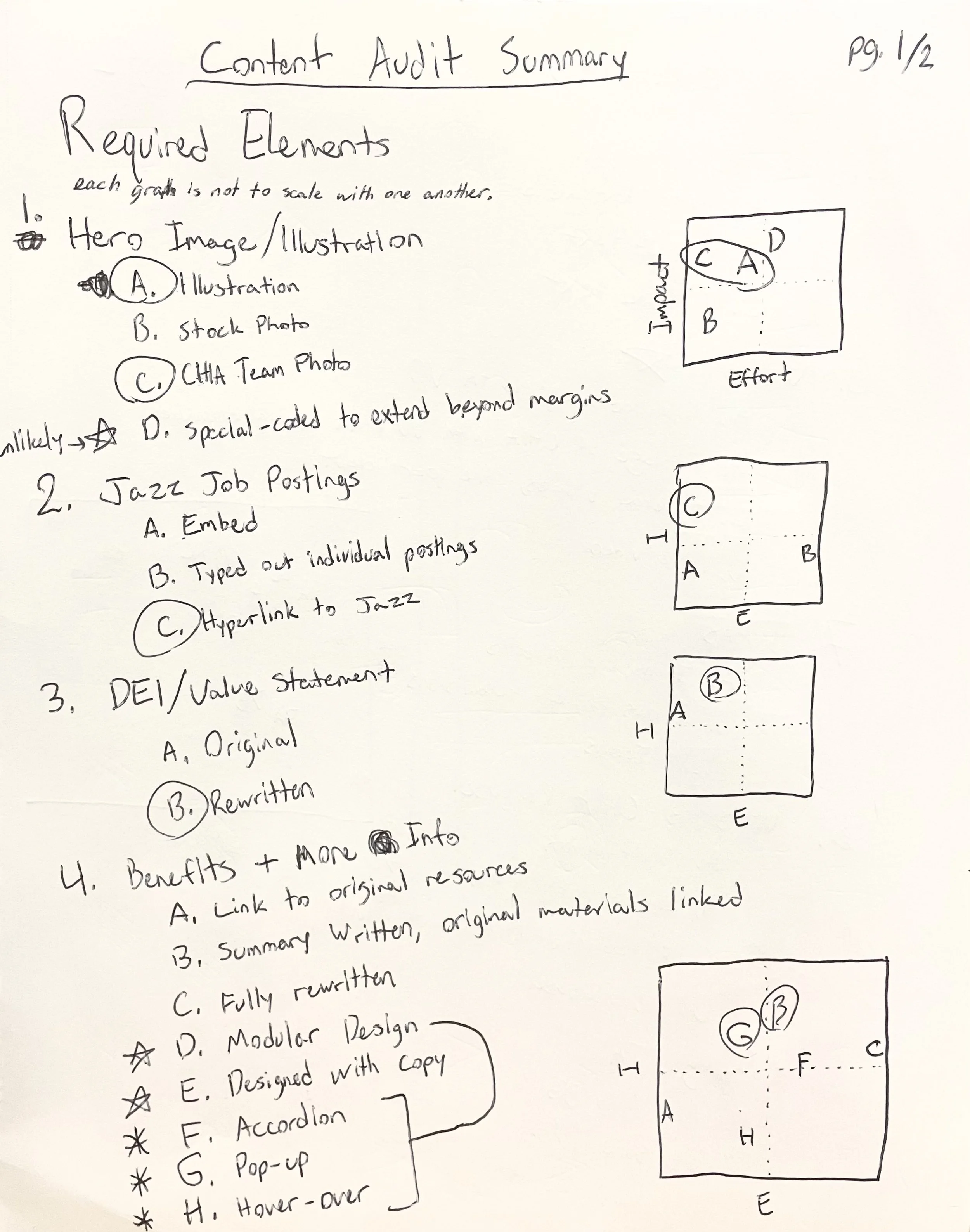
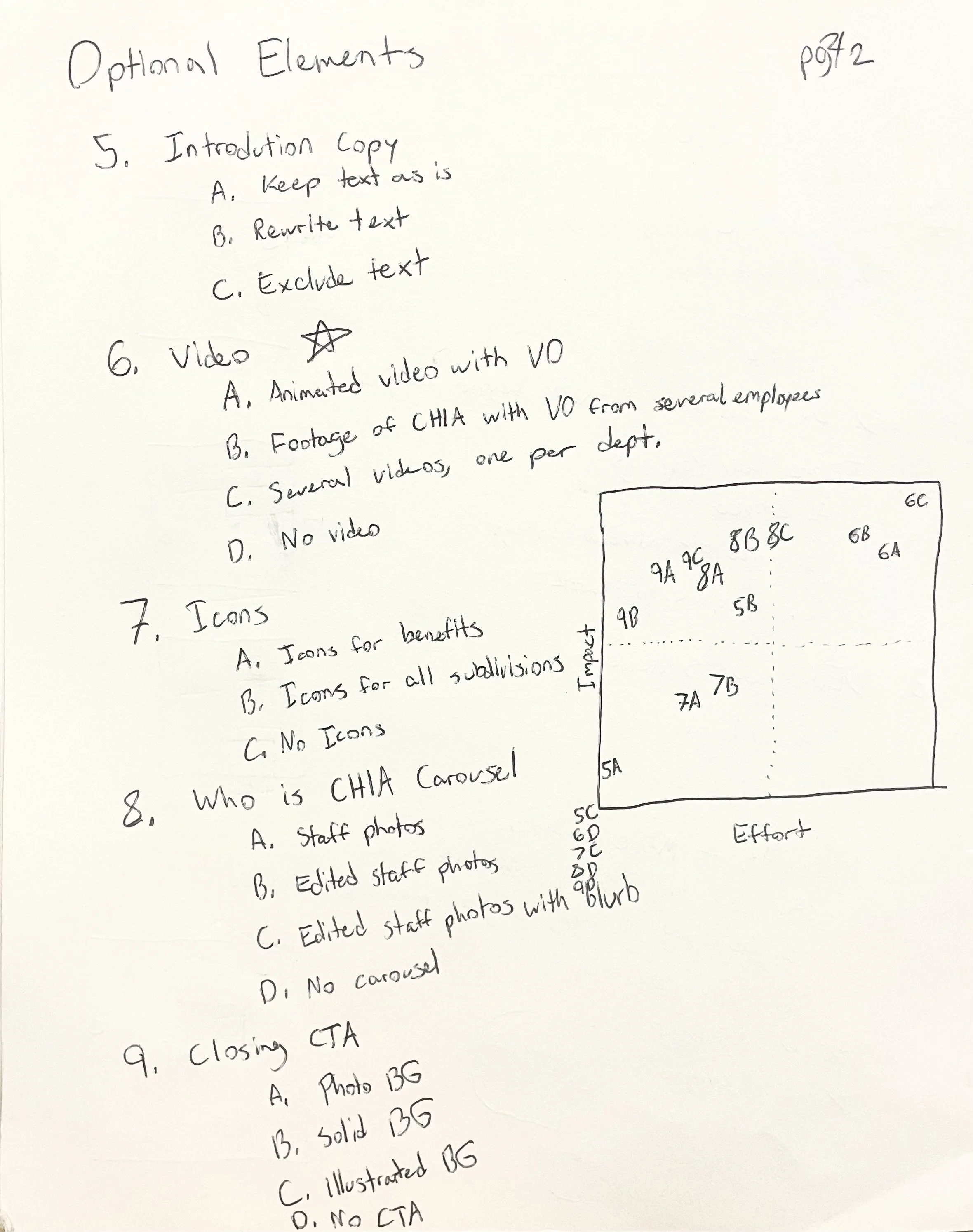
I compiled the best ideas into a list, then used this list to help create a content audit that includes potential features as well as existing ones—I called it an ideated content audit. This allowed me to organize my thoughts and evaluate the best options, whether they be left as they were from the previous page or changed entirely. Here is my audit:
I made use of effort-impact matrices to visually see the level of work and benefit each element would have.
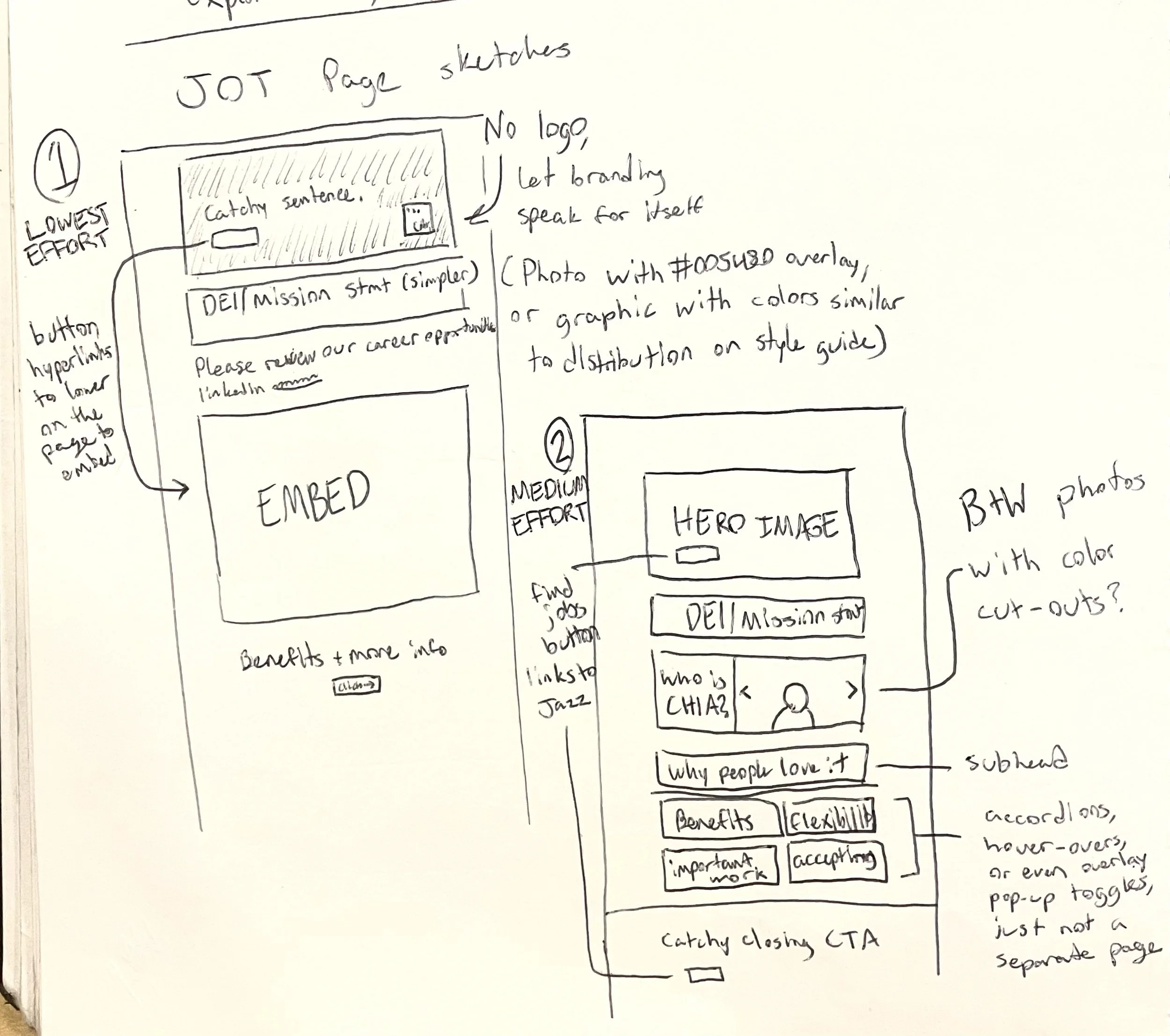
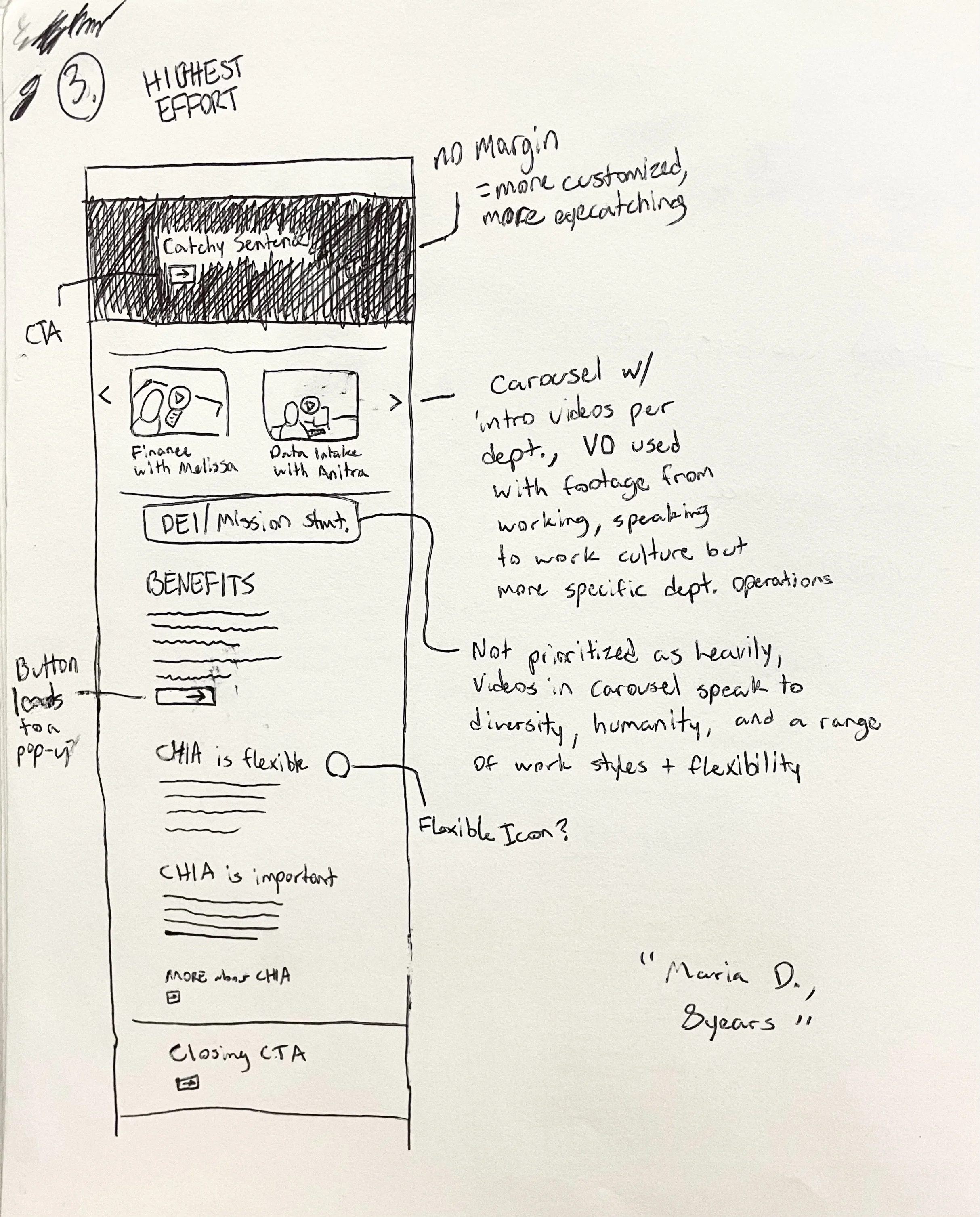
The website itself was constructed with limitations from the developers, meaning certain design options would require special coding or not be currently possible. Despite this, I wanted to see my ideas through and give possibilities if the website were able to support them in the future. I created sketches for three different “Join Our Team” Pages with varying degrees of possibility/effort, giving flexibility to the web and management team regardless of how much bandwidth they have. Here are the sketches:
These sketches were then workshopped with my team, then were translated into a digital version created partially in Adobe InDesign and partially in Adobe Illustrator. After many iterations, I had several mockups created with pop-up windows, proposed interactions, animations, and links.
The final step of this process was creating the presentation, which I decided to create in a way so I could preserve the width of each slide, allowing the slides that mockup the website to be viewed and scrolled just as it would appear on a desktop. The presentation can be found here:
“CHIA Mentoring” Logo
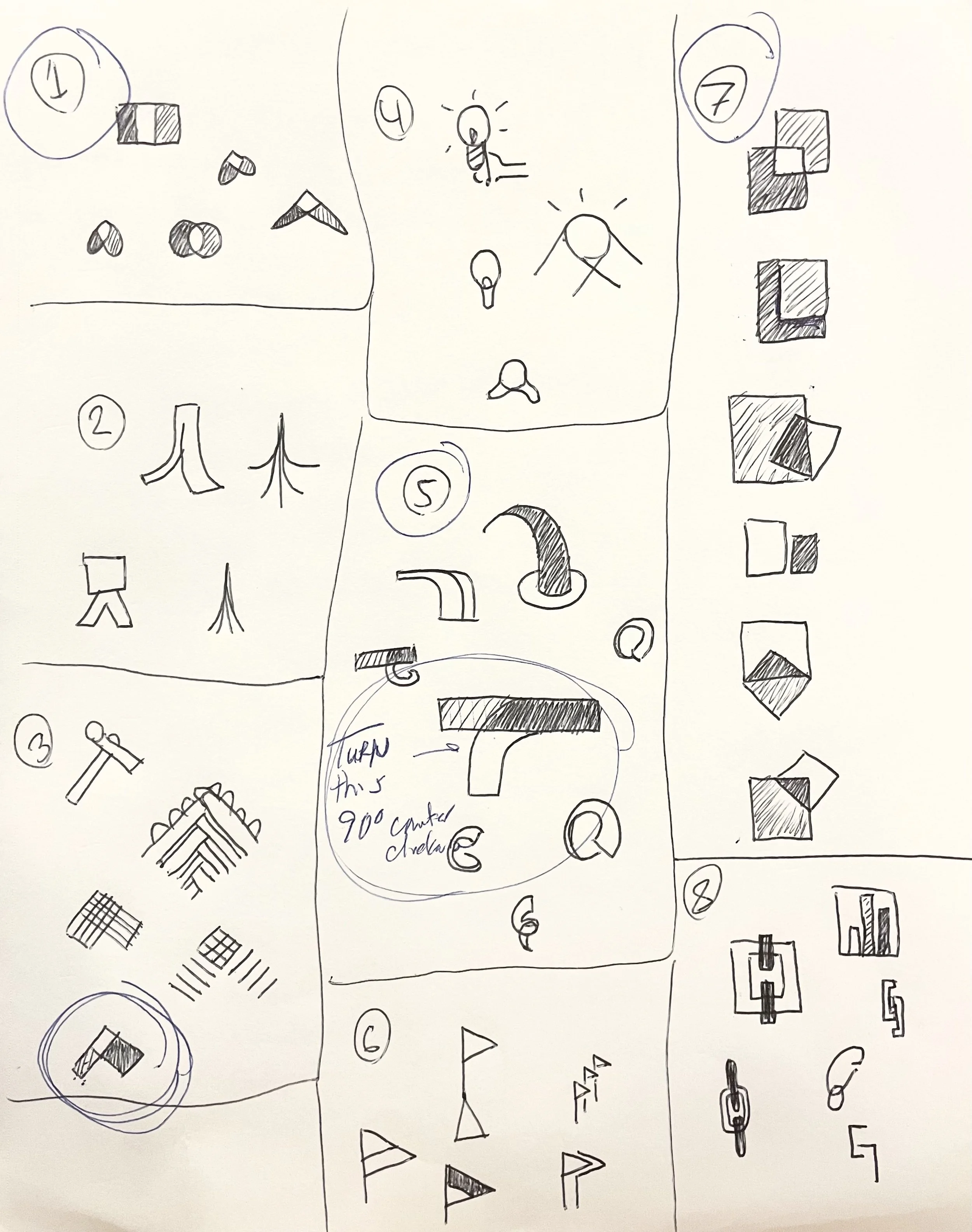
I began my logo creating process with research—understanding what the program wants to represent and demonstrate, looking at common associations with mentorship, and how I can build the two and combine into a greater final product. Different metaphors and iconography used to represent mentorship led me to different design concepts. Some of my sketches are shown below:
After workshopping, I digitized the logo concepts with the most promise. A second round of workshopping led my team and I to decide on four options, which were then refined further. The last step was to create a presentation going through my research, process, and results with different mock-ups.
Logo Animations
The logos that I have worked with over the internship, that being the CHIA logo and the mentorship program logo, would both benefit from being animated. I created these animations to be a useful addition for media output through social media and videos, with an emphasis on improving understanding and reinforcing design decisions.
For example, the CHIA logo has three squares in the upper left corner, and one in the lower right, beside the ‘CHIA.’ The three squares together in an ellipse are meant to represent incoming data, yet to be processed and reported on, and the last period gives a sense of finality with a simplified, refined output. I wanted to visually represent this concept by beginning the animation with an entrance of the ellipse, introducing other elements, then concluding with the final period. A similar process was used for determining the other animations, using symbolism and association to connect the underlying concepts.
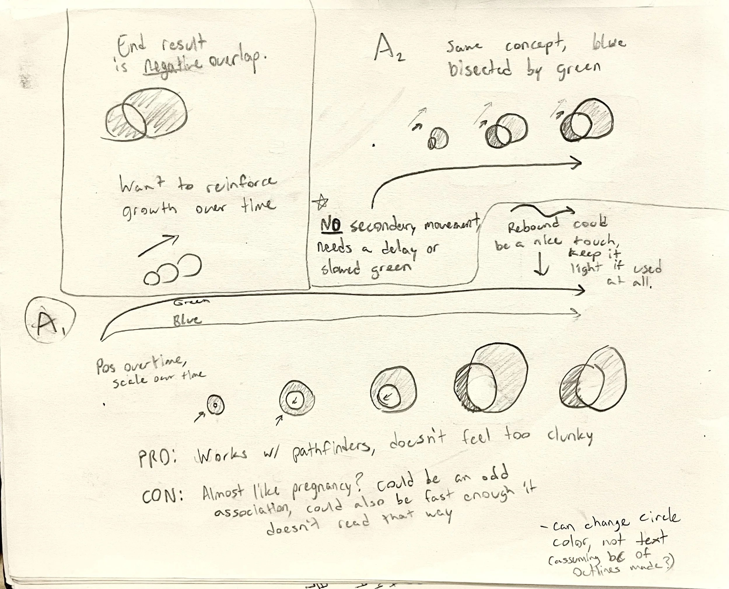
The mentorship logo in particular required a special level of detail. As the creator of the original logo, I had a desire to create an animation exactly in line with what I already designed, but also adding to that idea without any extra confusion. My sketches of this animation are shown below:
The animations underwent extensive revision from myself in order to have the best end product, fortunately this effort paid off and there was very little changed after presenting. The animations can be seen below:
Made in Adobe Illustrator, InDesign, After Effects.


